I performed a study regarding the usability of the iPhone X Side Button in 2020 as a course project for the course Human Factor: Working with Users. Back then, social distancing just introduced due to COVID-19, I did the study a bit differently...
Introduction
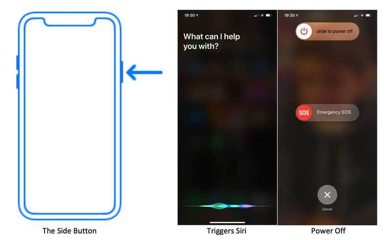
The purpose of this study is to evaluate the functioning of the iPhone X's side button. The problem I found is that the behaviour of long-pressing the side button is unexpected on the iPhone X, triggering the voice assistant, Siri (Apple, 2020), instead of shutting down the phone.
For Android smartphones and previous iPhones before the iPhone X, long-pressing the side button will allow users to shut down the phone. The iPhone X subverts this expected behaviour by instead launching Siri. Users will be confused when encountering this behaviour for the first time. (Reddit, 2018) The number of times people searching 'shut down iPhone' increased a lot after the iPhone X released. (Wikipedia, 2020) (Google trends, 2020) Shutting down the iPhone X is more complicated now, requiring the user to simultaneously hold one of the volume buttons and the power button. Then the screen will display a "slide to power off" bar that the user can use to power off the device. (Apple support, 2020)
I wanted to find out the possible reasons for Apple to change the side button's functionality and ways to make the button more usable. I, therefore, focused on testing users' attitudes toward the change and their potential suggestions.

Background
The motivation for studying this problem comes from many aspects. Below I consider aspects of the ABCS (Ritter/Baxter/Churchill, 2014).
- Behavioural factor: perceived affordance (Norman, D. A., 1990) is subverted since the button's behaviour changed while the layout remains the same.
- Cognitive factor: the users' Mental Models of system operation have to change. Since iPhone users are already familiar with previous iPhones, they'd assume long-pressing the side button will lead to shutting down the phone based on their previous experiences. Changing a mental model can be challenging; while it is possible, it is a lot of work. (Chi, 2008) Since users of previous iPhones struggle to power off the phone, so would Android phone users and others.
Looking at 7 Questions Driving User-Centred Systems (Ritter/Baxter/Churchill, 2014):
- Functionality: the purpose of the change is to compensate for removing the home button. The side button is now used for the features of Siri and Apple Pay. (Woollaston, 2018)
- Usability: Based on personal experience, when I first found out the side button of iPhone X does not have the power-off function, it was 15 minutes before the exam to start, I was already stressed, this made it worse. Therefore, as a veteran iPhone user, according to the definition of usability (ISO standard 9241), I would say it is not very usable.
- Learnability: it is easy to learn the new way to shut down iPhone X, as users just need to look up the Apple support documentation and practice using it. However, it is inconsistent with the way other iPhones work. (Kendra STheo J.D., 2017)
- Efficiency: the efficiency of the new way to power off the phone decreases since users need to long-press both a volume button and the side button until the power off slider appears, not as before, we just need to long-press the side button.
- Reliability: once users get used to the new power-off method, the function of the side button will remain consistent through the lifetime of the phone, so it is reliable.
The design change is acceptable in some aspects; however, in most of the points mentioned above, the design has some issues.
Participant
Participants were selected from people who have never used an iPhone X before, such as people who use Android phones only or people who use previous versions of iPhones only. People who have already used iPhone X before or know the iPhone X very well were not recruited. Since they were already familiar with it, they might have forgotten how they found the design change at first. I did not choose any participants under 18 or any other vulnerable people in my study. I recruited three people in total. Recruitment were done through friends and students who also took The Human Factor at the University of Edinburgh, participating in their studies in return as an incentive.
Method
The study was completed through video calls using WeChat to imitate the paper prototyping method and observe social distancing. Both participants and I made sure we were under stable internet connections and without distractions. Before the study began, I sent digital consent forms to participants, notifying them what data will be taken from them. I did not collect participants' personal or confidential data. After they signed the consent form, information sheets were given to participants for consistent information delivery among all participants, including the purpose of this study, what the process will be, and what task they will be doing. In the meantime, I answered any questions they had.
When all information was delivered, they were asked to turn off their phones during the study, and I presented them with the iPhone X through the video call. They said their actions out loud. I acted as both facilitator, speaking with participants, explaining what is going on, and taking notes; and the computer, showing participants the device state reacting to participants' actions. Their task was shutting down the iPhone X. During the study, they were allowed to use the internet to search for information to shut down the iPhone X. The number and the kinds of steps they take to complete the task, such as opening system preferences or searching 'iPhone X shut down' in a search engine were recorded. The greater the number of steps or the greater the variety of steps taken, the less usable the side button is.
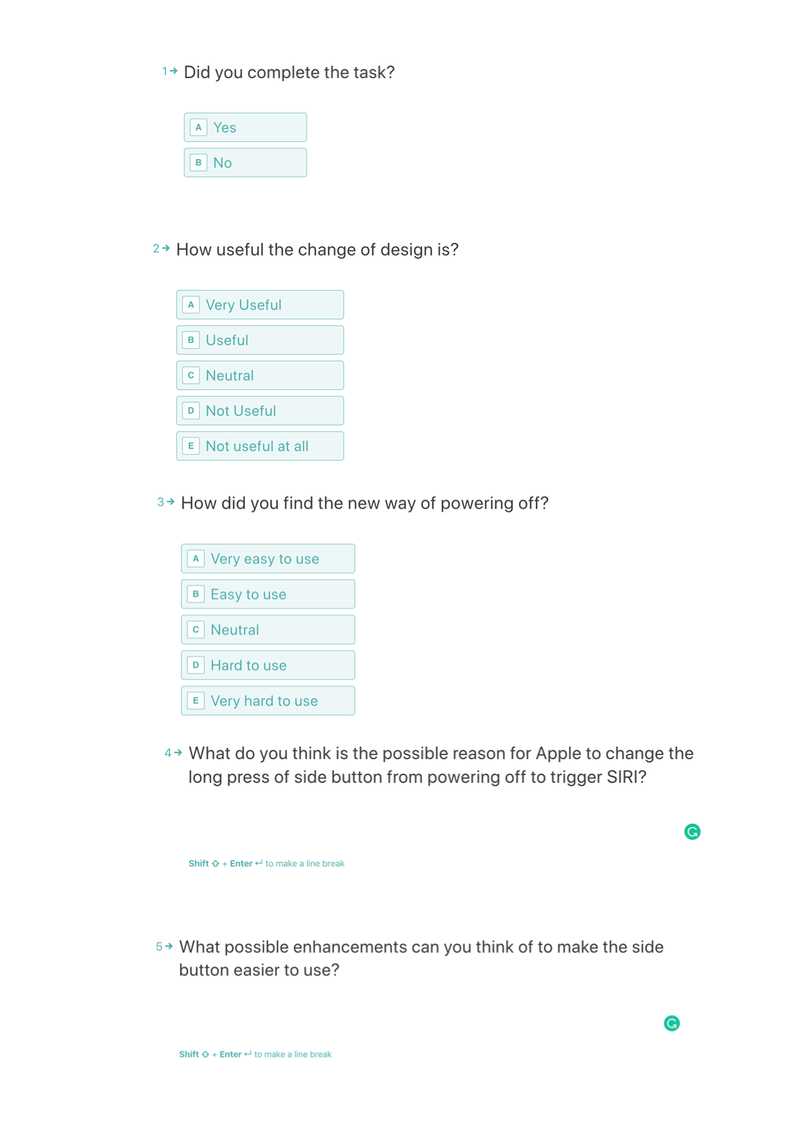
After the call, an electronic survey powered by Typeform was immediately delivered to each participant regarding whether they completed the task or not, and their satisfaction and experience with the design change. Questions like 'how useful the change of design is', ranging from 'Very useful' to 'Not useful at all', and 'how did you find the new way of powering off' were featured in the questionnaire. The possible reasons for the design change and suggestions for possible enhancements in the design were also asked in the survey. The questionnaire looked like the figure below. All the data were kept digitally and encrypted, no Google products were used. Qualitative data was based on participants' answers in the survey, and quantitative data was based on the steps and categories recorded.
Analysis
The analysis included descriptive statistics such as the average number and categories of steps participants take to complete the task, the modal number of the choice people make regarding the question 'how useful the change of design is' were computed. The higher the average number of steps participants take, the more complex it is to use the side button, the less usable for the side button to perform powering off. The modal number of the choice made can show what attitudes participants hold. I used pie charts to analyse participants' responses. I compared and grouped suggestions for possible enhancements and the participants' reasons for the change in design.
Results
There were three participants recruited through my friends. They were all aged 21 to 23 years old and female. They are all university students with good experience with electronic devices such as smartphones and computers but hadn't used the iPhone X before and weren't aware of the change in functionality of the side button.
I recorded the number of steps participants took to complete the task and how many of them completed the task. I also recorded how useful they think the change of design is and how easy they find powering off the phone using the new design. In the end, I asked what they think of the possible reasons for Apple to change this design and what their suggestions are for improving the usability.
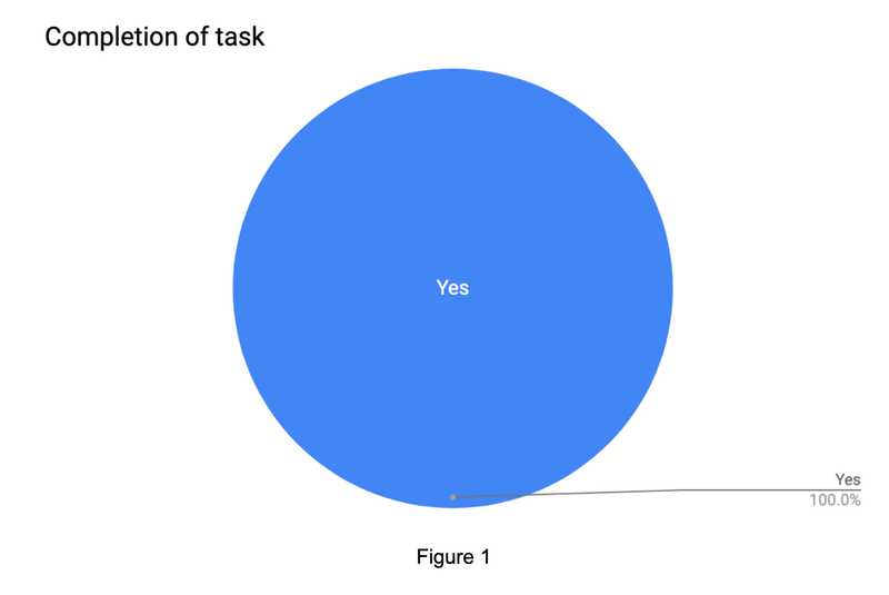
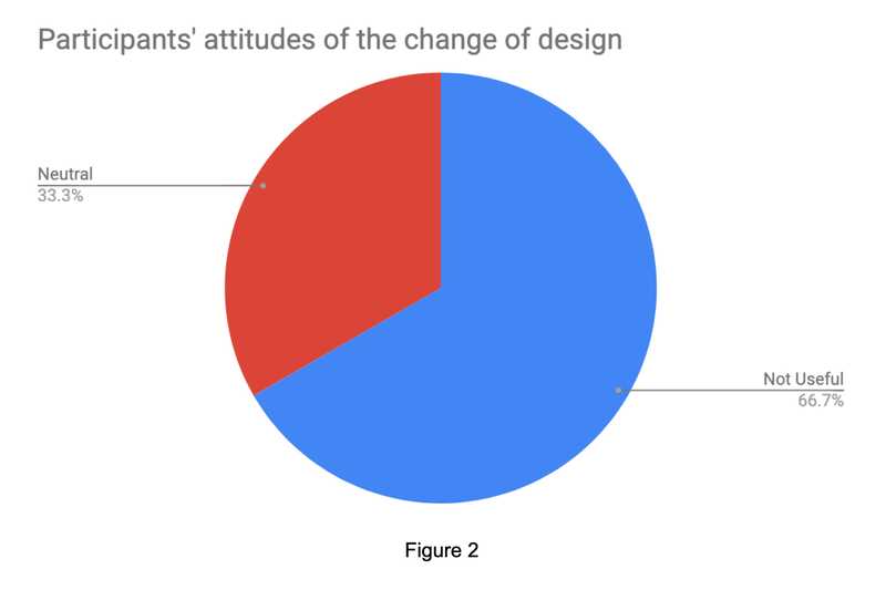
As shown in Figure 1, all of them completed the task of powering off the iPhone X successfully. Two participants, i.e. 66.7% participants, as shown in Figure 2, found that the change of design is not useful at all for powering off, and one remains neutral. Each of them holds different views towards the new way of powering off, one thinks it's easy to use, one thinks it's hard to use, and one thinks it's very hard to use. The below table shows participants' opinions towards the potential reason for changing the design and their suggestions for improvement:
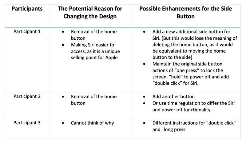
Most of the participants assumed it's because of the removal of the home button, and one seemed unsure. Still, she cannot understand why Siri is important enough to replace the side button's functionality for powering off. Most participants mentioned adding another button, but one of them stated that it would then lose the meaning of reducing the home button. They also mentioned different types of pressing the side buttons to trigger either powering off or SIRI, such as "triple click" or "long press". An interesting suggestion would be using time regulation to differ the SIRI and power off functionality.
Discussion
By assessing the usability of this new design in terms of efficiency and subjective satisfaction, the results showed me low usability. By considering the efficiency by counting how many steps on average have been taken, the efficiency is low. The expected steps for people using a phone for the first time are 2 steps, i.e. long-press the side button and then slide the power-off sign because people are used to standard phones. Since the average is 4.67 steps, comparing with the expected steps, it's more than twice of it.
The small number of participants reduced the generalizability of the conclusions drawn from these results since the participants all don't regularly use Siri, so their attitudes towards the design change could be biased. On top of this, the participants were all from a very narrow demographic, and so the study can't comment on how other demographics would react to the change.
I found during the experiments that telling people to power off the phone primed them to think that it wouldn't be as simple as they would expect. This was evidenced by two participants not attempting to long-press the side button as their first action. I would change this in a future study by telling participants that it was a usability study of the iPhone X, as opposed to specifically mentioning that it is about the change in side button functionality. I would also add other steps before switching off the phone to put participants at ease.
Due to the effect of the pandemic, the measure of time taken by the participants to complete the task cannot be achieved. Otherwise, the efficiency could be measured in this way. Also, it was difficult for participants to see what was on the screen, due to some unstable connections.
Proposed Solution
Based on my data, most people find it inconvenient to power off the new way instead of the old way. According to their proposed possible suggestions, I considered "long press" remains for powering off, and "three clicks" for SIRI since most people could trigger Siri by saying "Hey Siri". ("double clicks" is reserved for Apple pay) This is motivated by my data since all three participants mentioned changing the behaviour of the button back to the old "long-press to power off" way. On top of this, the participants believed that the change was due to the removal of the home button, and this change would not go against that motivation.
References
Apple (2020), Siri does more than ever. Even before you ask. Available at here
reddit (2018) [help] Can't turn off phone because of Siri. Available at here
Wikipedia (2020), iPhone X. Available at here
Google trends (2020) Available at here
Apple support (2020), Restart your iPhone. Available at here
Ritter/Baxter/Churchill (2014), Foundations for Designing User-Centred Systems, Springer
Norman, D. A. (1990), The Design of Everyday Things. New York: Doubleday
Michelene T. H. Chi (2008), International Handbook of Research on Conceptual Change, Chap.3 Three Types of Conceptual Change: Belief Revision, Mental Model Transformation, and Categorical Shift, P69-70
Victoria Woollaston (2018) iPhone X review: Apple's expensive iPhone X is still a thing of beauty. Available at here
ISO standard 9241
Kendra STheo J.D. (2017), Libri: The International Journal of Libraries and Information Studies, P106