The problem
I wanted to help people who don’t have time to practice and learn the ukulele every day because I have a ukulele, and I found it hard to keep learning and practising the ukulele. According to the survey I did for people who are interested in ukulele or ukulele learners (around 20), this is the most common pain point they have.
The solution
I designed a ukulele learning app that will motivate people to play the ukulele every day. It minimizes the time that people need to spend on the ukulele while still making progress and has a virtual pet to keep them entering the app every day.
My role
I ran the entire project by myself by surveying to find out people’s needs and made the persona according to the needs and pain points I found. I also did the customer journey map, paper prototyping, low fidelity prototype and high fidelity prototype, and conducted the usability test.
Empathise with users
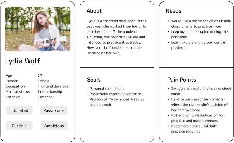
To empathise with users and find out their needs I did surveys from people who are interested in Ukulele or have experience with it. Surveying is one of the quickest and easiest ways to gather information in a short amount of time. Plus remaining COVID safe. I sent out the surveys on social media and in the end, 21 people responded. After summarising the results, here’s the persona I created based on the top three needs and pain points:
Ideate solutions
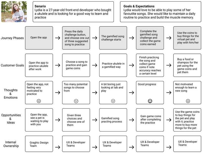
I did some research on existing Ukulele learning apps, such as Yousician. I adapted the gamified song challenge concept to make the practising experience more fun for the users. As illustrated in the final design section. I used the SCAMPER method to ideate. I also used the persona to produce an experience vision, which acts as a picture of what users' experience of using the design will be like.
Sketching & Wireframing
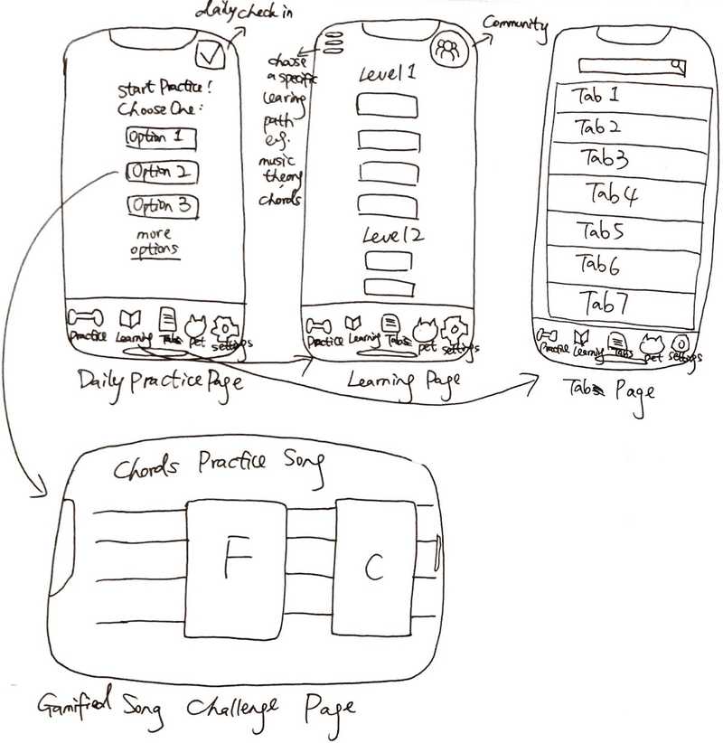
I started the design process by sketching on paper. I jotted down my very initial thoughts of what the main functions of this app should look like and what elements it should have.
Testing my design
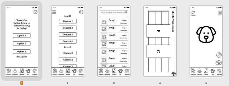
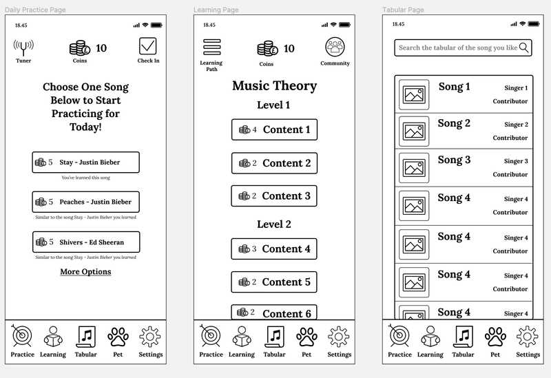
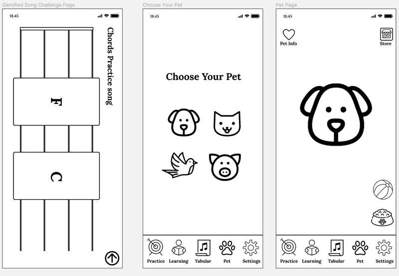
I did two runs of user evaluation with 5 people each run using the low-fidelity prototype shown in Figure 1. I used the think-aloud method to ask them to perform a few tasks and asked them to fill out a survey afterwards. I chose think-aloud method is because it's a very efficient way to know users' thoughts while they perform the tasks. Their feedback after the first user evaluation is summarised in Figures 2 and 3. And my changed design is shown in Figures 4 and 5.

Adjusted design:
- Added names under icons

Adjusted design:
- Added coins indicator indicating how many coins users have (A symbol stating how many coins I have)
- Added information of how many coins do each song give users (How many coins do each song give me)
- Added options to choose the pet (Options to choose the pet)
- Added information of each suggested-to-practice song (Information about the suggested songs, whether they are randomly picked or I learned them)
- Added a tuner (A tuner)
Final results
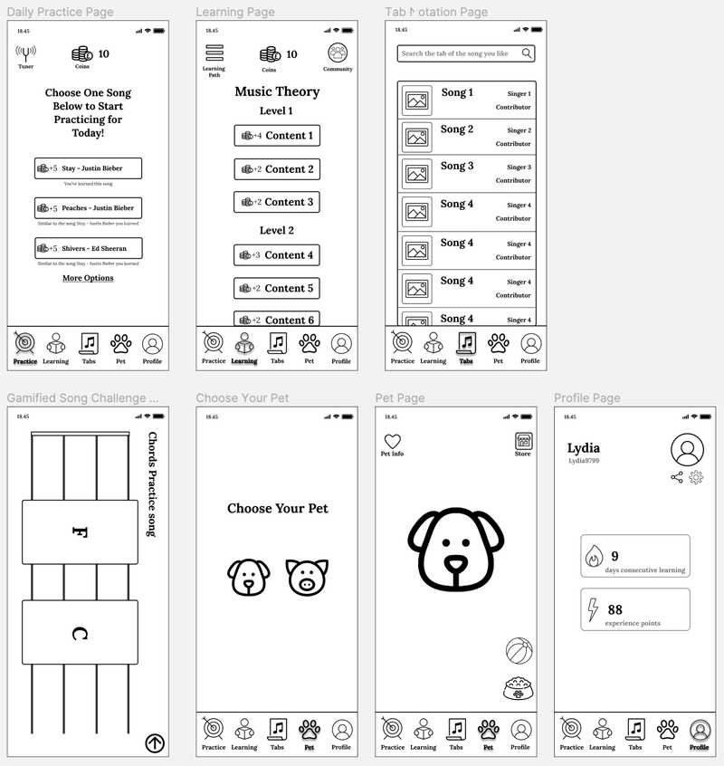
After two runs of user evaluation, the suggested improvements are summarised in Figure 6 and 7. I changed the design accordingly. You can find the interaction design here.

Adjusted design:
- Added feedback when clicking on a page by making the page icon darker and having shadows (Not sure which page I was on)
- Renamed the tabs page to be Tabs (Not sure what Tabular means)
- Removed check-in button because users might just check-in and don’t do any practice. Now if users want to earn coins they will have to either practice a song or learn a new lesson. (Not sure what the check-in is for exactly)

Adjusted design:
- Added a profile page which shows users’ statistics such as learning experience points (A statistics page to see my progress)
- Added plus signs before coins to indicate how many coins can users gain when they practice a song or learn a new content (A better indication that the coins will increase when practicing a song)
Self-reflection
This is my first user design case study. I’ve familiarised myself with the design process. I haven’t applied any colours to the design yet, which could be an extension project.